The ultimate interior design guide to layering
The key to successful interior design is getting all of the elements of a room to pull together and feel natural – while still achieving a sense of individualism.
We do this through a process known as ‘layering’. You’ve probably heard about layering in fashion – it’s used to add a dynamic element to an outfit. The same principle applies in interior décor; it elevates a space from the every day to the unexpected.
Layering is not an official interior design principle, which makes it something of a secret weapon for skilled interior designers.
When approaching an empty room that presents itself as a blank canvas, interior designers start to visualise the potential of the space in layers.
Even when a space is furnished, a refresh always benefits from the same approach.
Do it right, and layering your room will make it extraordinary. If you’re planning a refresh, or simply starting from scratch, this guide will show you how to use layering in the most effective, impactful way.
The basic formula for layering
To start thinking about layering a room properly, all you need to do is break the room down into categories. They are:
• Wall coverings – paint, wallpaper or something else? We’ll explore options in the section on texture later on.
• Flooring – wooden floorboards, carpet or vinyl?
• Furniture – different for every room.
• Soft furnishings – your pillows, blankets, area rugs and bedding all have a significant impact on the overall impact of a room.
• Lighting – ceiling lights, sconces, table lamps, floor lamps and other ambient features all have a role to play.
• Wall elements – works of art, mirrors and photos could liven up an empty space.
• Décor items – flowers, coffee table books and the bits-and-bobs that make it you.
Each of these elements is a separate layer and should be taken into account individually. Stay focused and add each layer, one at a time.
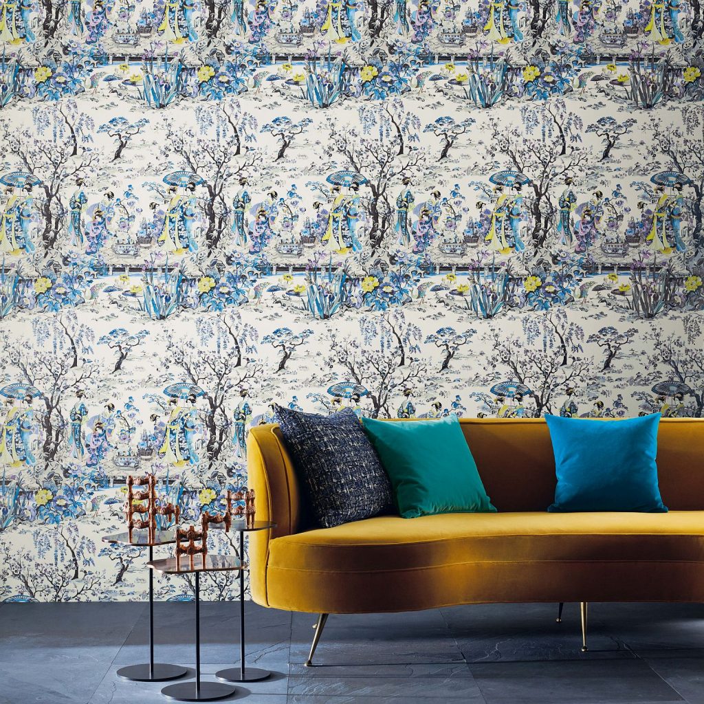
Layering with colours
Choosing a colour palette takes skill. If you haven’t yet hired an interior designer, think about contrast (choosing opposite shades on the colour wheel), and complementary tones. It’s important to know the kind of mood you want to be in when you’re in that room: colour is extremely emotive and a simple shade of paint can slightly alter your emotions on a long-term basis. It really is that powerful.
Psychologically, humans like to reflect their natural surroundings. When we’re outside, colour tends to go from dark at the bottom (muddy, grey and deep green tones) to lighter (floral colours work well at eye level) to very light, like the sky. Employ the same process in your interior space, and it will feel natural and not at all forced. More often than not, choosing a ceiling colour that deviates far from whites and creams can be oppressive. There are exceptions to prove the rule, of course; though bold choices like that are certainly best left to the professionals.
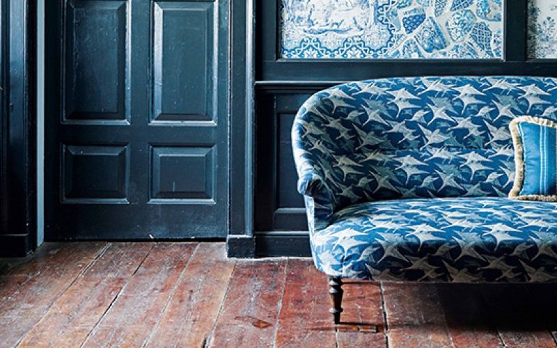
If you’re working on a budget, pay close attention to soft furnishings. A rug can be a cost-effective way of injecting colour into an otherwise ordinary room. Think back to contrast, too: if the rest of your room is neutral, you can play with contrasting colours within your soft furnishings layer. Mulberry Home’s Flying Ducks fabric can liven up a space, whereas Osborne & Little’s Carnival injects colour. Choosing the right fabrics is key, and if you’d like to speak with our interior design team, you can book an appointment here.
10 colour trends for 2018 and 2019
Keep a close eye out for these colour trends. Whether you go for something that will stand the test of time; or whether you’re after something that packs a punch, you’ll find your inspiration here.
• Ultraviolet: This was Pantone’s colour of the year for 2018. Dramatic and provocative, this is one to consider carefully to ensure it has the best impact.
• Ocean blue: coming straight out of our obsession for all things Moroccan, this jewel tone feels distinctly exotic.
• Sage: this greyish green makes any space feel calm and tranquil.
• Olive: like sage, olive colours have a traditional element – making both colours perfect for classic spaces.
• Stone white: too crisp, and whites can feel clinical. But stone white shades have some warmth, making them perfect for smaller spaces that need to feel light and inviting.
• Crimson: pair this strong red with white and wood to make the most of its warmth without darkening the space too much.
• Deep turquoise: Deep, jewel-like tones should be embraced wholeheartedly. Peacock feathers are a classic aesthetic to represent eccentric luxury: be inspired by them.
• Blush: also known as ‘Millennial Pink,’ this peachy salmon shade can be neutral or a feature tone.
• Marigold: whether summer or winter, a mustard yellow provides a retro, playful vibe.
• Dusk: this blue is a sigh of relief. City homes can use it to incorporate beachside luxury without feeling like too much of a pastiche.
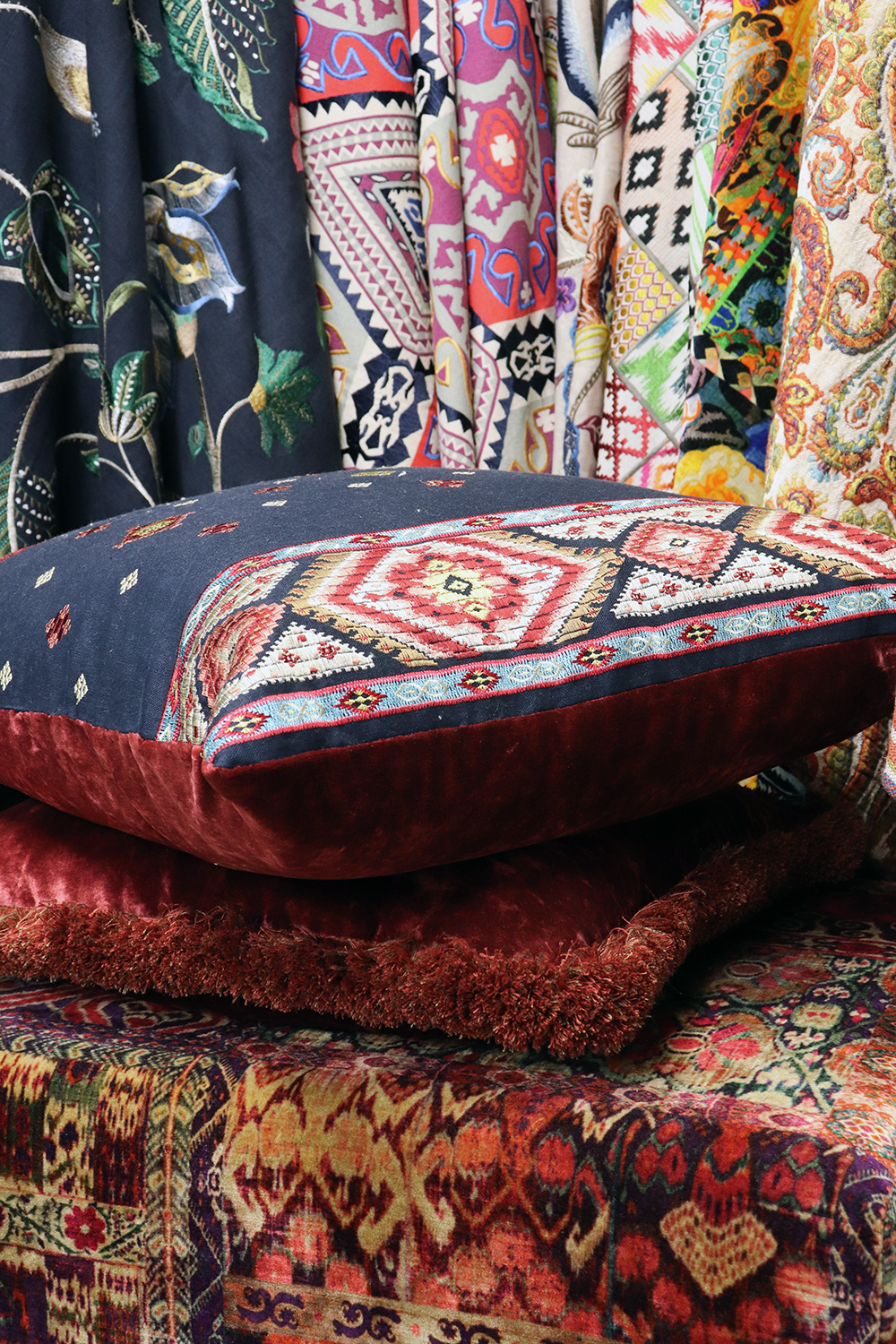
Layering with textures
In order to make a room feel inviting and comfortable, you’ll need to pay close attention to the textures you choose. With almost infinite possible combinations of textures, colours and patterns, pay close attention to what works in order to create the most relaxing space.
When you’re thinking about layering textures in a room, start from the bottom up. Your flooring can, of course, be wooden or carpeted; or you might choose to lay down some vinyl.
In 2018, we’re seeing the rise of layered rugs – perfect for those times when you can’t choose between two favourites. If they’re both from a complementary colour palette, you’ll have the freedom to make an impact with two different styles. Pinterest is overflowing with images of cowhide rugs placed on top of seagrass or jute rugs. It’s a delightful and versatile look; that’s for certain. But if you want to shake it up, have a think about some other combinations you could try. We love seeing a large jute rug neutralise the floor, with a smaller Persian-style rug in bold colours to inject some creativity. The only rule with layering rugs is to make sure the smaller one is on top.
Many people think textures are limited to the soft furnishings of a room, such as fluffy cushions, leather chairs and wooden coffee tables. However, textured walls can add an extra-luxurious vibe to a room. It’s a tricky concept to get right – we’re still haunted by the woodchipped walls of the 80s – so it’s often best to call in a professional if you’re making a bold move like this.
After years of Scandi obsession, we’re seeing more earthy textures that help to relax an otherwise clinically-clean space. The trick is to think big: if you’d toyed with the idea of a headboard made of wooden slats, why not make a feature wall with wooden covering? This often looks most authentic with reclaimed boards. Pair your feature wall with an overall neutral palette, and you’ll have a bedroom that feels like a modern, upmarket log cabin. It’ll be perfect for some escapism at the end of a long day.
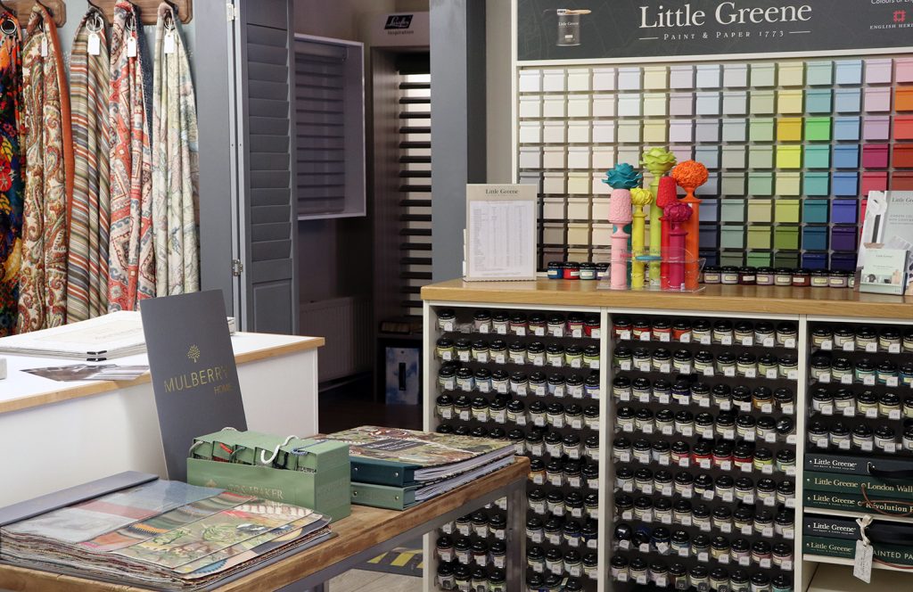
Of course, if you’ve chosen to have a smorgasbord of textures in your room, you might want to keep your walls simple. Little Greene Paint Company Limited offers timeless colours with a variety of finishes. They’re some of our favourites: our clients always love the classic, elegant touch they give to a space.
Take a look at the Little Greene range here.
Texture and pattern trends for 2018 and 2019
Over the next 18 months, we’re seeing a lot of trends that complement the colour trends we’ve already predicted earlier in the blog post.
• Dark wood: sumptuous, deep oak wood is interior design’s answer to Hollywood glamour. Get it wrong, and it will jar with the rest of the space. But get it right and you’ll make the space irresistible.
• Global: travel has long inspired interior design trends. Tassels, mixed fabrics and earthy Asian woods will reign supreme until the end of 2019 – and perhaps even beyond.
• Handmade: rattan and wicker furniture has made a huge comeback. Macramé, too, has made waves in interior textures.
• Fringing: this unlikely trend took its inspiration from the catwalks. An eccentric look, it should be approached with caution; but when it’s done right, it wows.
Now you’ve got a better idea of how to layer colour in your home, our team can help to expand your plans and turn them into reality. Our curtains and blinds are all handmade on-site in our studio. We work with exquisite fabrics, wallpaper, and wallcoverings to help you shape your home into the perfect living space to be enjoyed for years to come.
All of the pieces mentioned in this blog post are part of the Butterley portfolio. Pop in to see the full ranges at our Eccleshall Studio in Staffordshire, where you’ll get inspiration from designers such as Mulberry Home, GP&J Baker, Colefax and Fowler, Designers Guild, Jane Churchill.
fabric, home, home decor, interior design, interiors, layering, wallpaper